Monday, June 30, 2014

Year O Graphy Calendar

As I was going through the Year O Graphy paper pack by Simple Stories I kept seeing calendars and mini books. So I gave in and made just that. First up I made a magnetic wall calendar. I had some sheet metal that my brother mitered the edges. But this project could easily be done on the back of and inexpensive cookie sheet. And I would recommend you use that because it would be easier to hang on the wall. The size I have here is 12 X 18. I covered the front side with heavy duty tape any kind will do (red tape,sookwang)


The lined paper was just right for the base of the calender. Then I cut strips that would cover the rest of the metal. 


I started with the ruler strip first then added the lined paper and to cover the seam I put the phrase strip on top of the two.


Next I put the adhesive tape on the back side of a strip of paper and used my 1/2 in punch to punch out a circle. Peel off the tape and adhere it to a button magnet. Then top it off with a circle number sticker. You will get 1-31 with the sticker page. I did the same processes (but with sheet magnets) for the months of the year and for saying like mothers day.     


Ops I forgot to tell you about the strip of paper with with days of the weeks. The magnets can be moved for each month. I think this would be great for kids to learn the months of the year and days of the week.


And you can keep the leftover magnets on the back. Just a side note the sheet magnets I used was to thin and had a hard time staying on the front of the calendar. I would  recommend you not buy them at wall mart like I did.  And as always this project will be on display at Paper Forest Boutique in Washington Square Washington,IL. So stop by and pick up Simple Stories Year O Graphy for your next project.   


Thank You for reading and have a crafty day!
Kristi

Saturday, April 26, 2014

Mothers Day Craft With Prima Paper

I can't believe that a month has gone by with out having a post! Needless to say my family has had a busy month, with birthdays, Easter, and my son coming home for a long weekend. I have a lot to do to catch-up.

Mary at the Paper Forest gave me a packet from Prima Marketing called Stationer's Desk. I fell in love with this paper immediately,It has a vary vintage look and feel to it.  My paper obsession started to kick in and I was having a hard time thinking of what to make. I have a confession to make, I love to hoard paper!!! If I find something I love I can't part with it. This is probably the real reason I am late on my projects.

My first project is a 3D craft. I made a paper covered tin to hold flowers in for Mothers day. I thought this would be an easy project for kids to help with. It's a vary basic project. Plus with Earth day this last week I felt the need to use something that I would normally throwaway.

I started with this can blueberry filling.


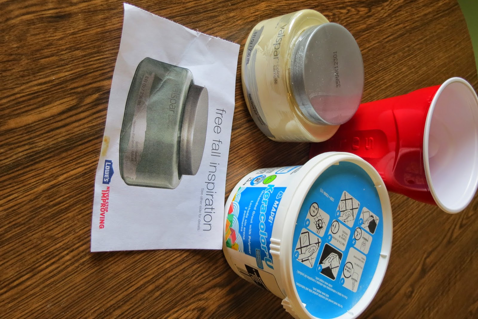
This is my favorite part. I used my free sample of paint from lowes then mixed some grout sand and painted the can.


I picked some paper that would work well with the paint. If you want to make this a real recycled project then you could use some scraps.


I have several different paper layers and I used the red sticky tape for my adhesive.


Simple but pretty.


On the back of the can I used some leftover butterfly's from my card that I made. That should be my next post.

Thanks for reading and have a crafty day
Kristi


Sunday, April 6, 2014

Spicy Social Soup layout

This is the last project that I am doing with the Jillibean Soup collection Spicy Social Soup. For these two layouts I used pictures from last summer. I found a recipe for lemon cake on pintrest. My mom loves all things lemony so I made this cake for her birthday. Then I shared pictures on instagram.
 

 So the story for the second layout is about how my husband dropped the cake as we arrived at the park. You might say we were not having a good day. So when I saw the die cuts that said, He Said and She Said and Status Update, I knew It would fit this layout perfectly.


I love layering this paper with diecuts and stickers. I added grommets to the corners and sprinkles to accentuate the status update and life is too short. Above I used the sprinkles in the bulls eye with the thumb's down.


   I used allot of pop dots to add more dimension. You can add pop dots to diecuts and diecut stickers.


If you would like to have a first hand look at these projects, they are on display at Paper Forest Scrapbooking boutique in Washington Plaza. Please stop by and say Kristi sent you.  My next project for the design team is a paper pack from Prima Marketing called Stationers Desk. Here is a sneak peek of a mini album I am working on.


Thank you for reading, and have a crafty day.
Kristi


Sunday, March 23, 2014

Altered Art with Spicy Social Soup

Today I made a altered picture frame with Jillibean Soup paper collection Spicy Social Soup. The colors in this collection are right on trend for 2014 and are easy to find the same colors in your or your child's closet. And that will make scrapbooking a breeze. Now onto my altered art. I purchased a plain black picture frame from Wal-Mart.


I painted the sides of the black frame with Tim Holtz Distressed Paint Sky Blue.


For the front I used red tacky tape and covered the whole front side. You could use and heavy duty tape or wet glue. Then I cut a matching color cardstock from the Bazzill paper collection, and matted the front .


The Paper Forest carries the entire line of Bazzill Cardstock. You must stop by and see their wall of color. Do you remember the circle paper that I mention in my last post called 1 part app.

I have a can of spray glitter that I purchased from my last trip to the Scrapbook Expo. This is perfect for me because I am addicted to all things glittery (or distracted by) With this can you can make any paper a glittery piece of art. So you might understand that after this glittery step I forgot to take a picture of covering the matting.


I glued the circles randomly to the frame and added the sticker letters to spell out #junior.


Thank You for reading and have a crafty day.
Kristi


Saturday, March 15, 2014

Spicy Social Soup Pop-N-Cuts Card

I am pleased to announce that I have been selected to be one of the designers for Paper Forest, a scrapbooking store in Washington IL. Each month I will be making one card, one altered art, and two 12x12 layouts.
 For the month of March I was given a paper pack from Jillibean Soup called Spicy Social Soup. This Paper depicts everything from social media. You can take a look at the paper here. This was a far cry from my normal lace and flowers that I like. But the more I worked with it the more I liked it. I especially Liked the paper 1 part app. This paper is full of one inch circles of different designs
.

Today I am going to share with you the card I made. It is a 5x5 square card and can be used as a birthday, engagement, or any other special occasion.


I cut green cardstock at 4x4 and used my circle punch to cut out the corners.


one inch stripes of paper cut at different lengths. Then I used the We Are Memory Keepers envelop punch board to crate a banner effect.


I used a mustered color cardstock for the base and Doolebug Design sprinkles on the corners. And some chipboard stickers to top off the banners. I like how there are spots to write your own date and likes
.

For the inside I used Sizzix Pop-N-Cuts Wavy Label Die and circle punch the corners.


One of the tricks to adding layers is acetate. I cut small strips and scored at 1/2 inch and then stapled it to the top of the pop-up. Then adhered die-cuts to the acetate, it will look like the arrows are floating in the air.


I added more sprinkles to the corners and a die-cut cell phone that you can add your own sentiment.


I hope you enjoyed this as much as I did making it. Stay tuned for my alerted art project. And If your in Washington please stop by Paper Forest and tell Mary, Kristi Sent you.
Thanks for reading and have a crafty day. 


Sunday, February 16, 2014

Simple Valentine

I hope everyone had a nice valentines day. Here in Illinois we had an unexpected snow storm, so my husband and I decided to stay home. He grilled some New York strip steak, bottle of wine and some old moves on T.V. It was a simple valentines night that I love so much. It was a simple night that went hand and hand with my valentine cards. I did not want to share my cards tell after valentines day because I did not want my family to see the cards before I gave it to them.   


This first card is an A2 with red trim background cut at 4 X 5 1/4. The white layer is cut at 3 3/4 X 5. And is embossed with the cuttlebug heart folder. The stamps I used all the cards are from My Creative Time Lots of Love Stamp Set. I love how the stamps have script and typed words.  


  •  For the next two cards I have the same measurements. I was digging through my valentine stash and found some stitched  hearts. All I did was placed the hearts randomly on the card and stamped the sentiment.


This last card was so much fun to make. First I took double sided tape,cut it to look like banners. Then applied  Elizabeth craft glitter and then colored in with Copic markers. The hearts are stamped with memento ink.

Now on to my next project. Thanks for reading and have a crafty day.

Kristi

Saturday, January 18, 2014

I have been working hard on my challenge. I might not have completed a project in a day but I did some creating everyday. And I would like to share with you what I have accomplished. If you remember I took some leftover scraps from past projects and I planed to use them up.

This is my second card, the background was embossed paper that I brushed my ink pad over to highlight the embossed parts. The flower background was paper printed with a neutral black and gray design, and I colored it in with copic markers. If you have pattern paper don't be afraid to change it up by adding your own color. I usually like to add glitter to highlight points of interest. Next I layered some die cuts and put it together with a brad, then pop dot it to the card along with a pop dot sentiment.
  

Next I did two 12x12 layout with pattern paper. I made these layouts without any pictures in mind. I hope to find some that fit this color palette. With this layout I used some coordinating lace and ribbon that matched the color scheme.  


I added three rows of lace to the side of the mating then added hand punched butterfly's in the layers. On the bottom of the mating I added a chipboard word with brads.


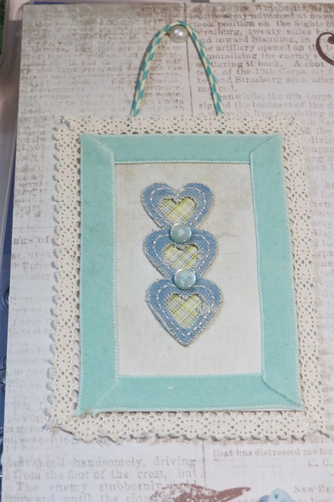
This is my favorite part. I had only one small piece of paper left, not enough for matting. so I made my own embellishment. I mitered the corners of the ribbon and adhered it to the front of the paper. Then I mitered the corners of the lace and adhered it to the back of the paper. Now for the inside you can put anything in it  a small pic, ticket stub or you could do what I did. I found a fabric sticker in my stash that matched perfectly. then topped it off with some bakers twine and a brad.  

The last thing I did was hand punched out the butterfly two times and adhered it with pop dots and tied some bakers twine to make the body.


And this is my last layout. I had some paper flowers that came in a kit, and I never know what to do with them. They come flat in plain, not my idea of a flower. so I inked the edges and the next thing I did might shock you! I made paper balls out of them. After you unroll them you have a flower with dimension, then add a brad and wala you have some amazing flowers.
  

Do you remember the all the paper I started out with? Well this is what's left. Not to bad, and ready to go in the garbage.


Thanks for reading and have a crafty day 
Kristi